UX/UI Design: Why It’s Not Just About Looks
Introduction
Beautiful screens are nice. Usable screens change behavior. The difference between a pretty UI and a thoughtful UX can be the difference between bounce‑outs and brand loyalty.
1. UX vs. UI—A Quick Primer
- User Experience (UX): the journey—structure, flow, feedback, satisfaction.
- User Interface (UI): the touchpoints—colors, typography, visual hierarchy.
Think of UX as city planning; UI is the building façade.
2. The Business Impact
| Metric | Poor UX/UI | Smart UX/UI |
|---|---|---|
| Conversion rate | 1–2 % | 5–10 % |
| Customer support tickets | High (confusion) | Low (clarity) |
| Session duration | < 1 min | 3–6 min |
| Brand perception | “Frustrating” | “Professional & caring” |
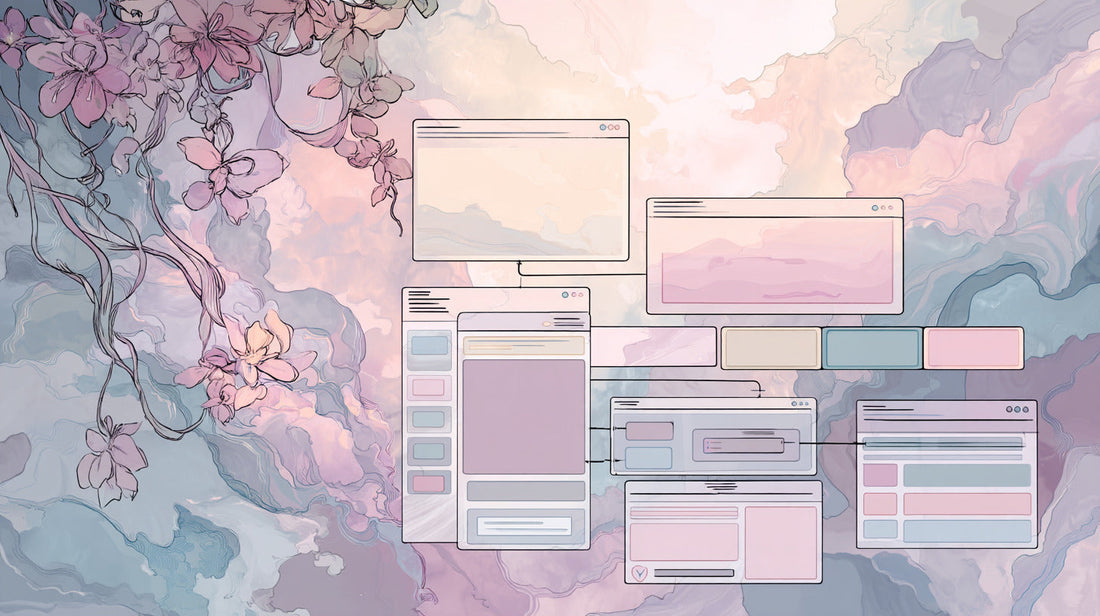
3. Anatomy of Effective UX/UI
- Clarity – Each screen answers one key question.
- Consistency – Components reuse patterns; users build muscle memory.
- Feedback – Loading states, success messages, micro‑animations.
- Accessibility – Color contrast, keyboard navigation, screen‑reader labels.
- Emotion – Subtle delight (empty‑state illustrations, success confetti).
4. Case in Point
A SaaS client of ours saw 38 % fewer abandoned sign‑ups after we trimmed a six‑step onboarding into three contextual steps with inline validation.
5. Integrating Design Into Development
- Kick off with design tokens and a shared component library.
- Ship prototypes early (Figma → React Storybook).
- Run quick usability tests before final hand‑off.
Conclusion
Good design isn’t vanity—it’s ROI. If your product needs to look great and perform even better, Bobolink blends research, aesthetics, and code into experiences users trust.